Signs are everywhere. We use them to communicate every day. Whether it be an actual physical sign or a look we share with our spouse or friend, they are a part of our lives. They can be a fantastic way to promote and draw people to your product, or they can be a tool that repulses glances.
What is shocking to me is that many people will put up signs without using much thought process. I feel like if a sign is going to be the face of your message or product, careful attention and deliberation should go into designing that sign.
So, to offer some amusement to your day, I am going to kick off this series of posts with some of the most awful signs I’ve ever seen. Here it goes.
Whew. That’ll grab your attention, and then compell you to keep on moving. It’s sloppy, tacky, and doesn’t really communicate what it is they are selling. And I’m not sure how any shopping experience can be both large and unique.
I know churches like to put signs up like these to provoke thought, in hopes that people will come in… but this just makes me think that they are trying to repel people. Rude!
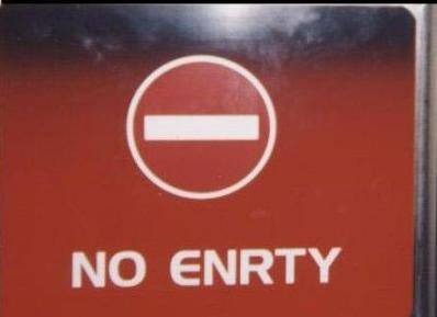
I don’t get it. Are you going to subtract someone?
Well that’s crystal clear.
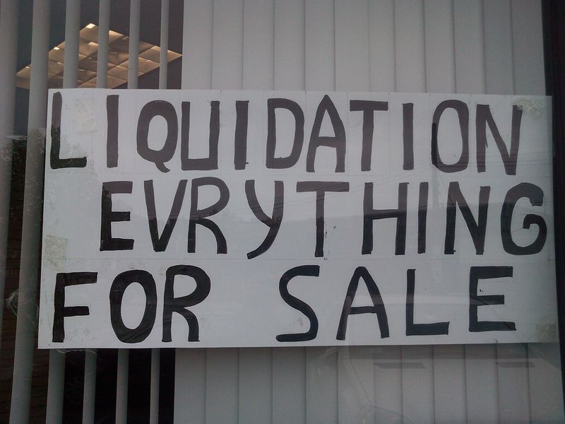
Ok, I get that if you are going out of business there is no point in paying for a liquidation sign. But it’s not a text message. Check your spelling.
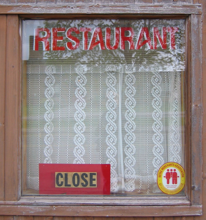
Your getting closer!
Well that was just terrible, wasn’t it? Don’t let your signs be like these sad, sad signs. Get a second opinion. And a third. And a tenth.


