When you are in the business of selling a physical product, packaging and labeling is really important. It should be an extension of your excellent signage, brand and overall mission. I’m a big fan of The Dieline and Graphic-Exchange. They feature such eye catching and interesting products on their blogs each day, ’cause let’s be honest: our hungry eyeballs are what fuel our consumer choices. What I love so much about these two blogs is that they have a wide array of product packaging/labeling that they feature, from nail polish labeling to a concept package design for beer. Even though my specialties have nothing to do with designing packaging and labeling, it still stimulates my mind and gets the creative juices flowing. Here are some recent products that have been featured on these sites that I simply adore.
I’m a big fan of Dia de los Muertos art, so a glance at Mic’s Chilli packaging made my eyes twinkle. I love the simplicity of the artwork and the incorporation of vintage coloring. It’s true to the Mexican holiday and yet still has it’s own flare.
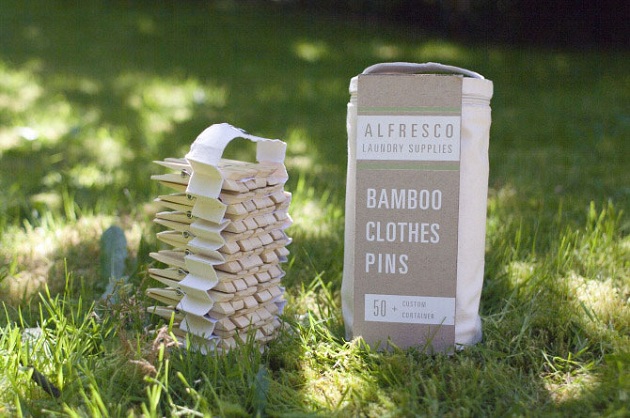
The neutrality of this Alfresco Laundry Supplies bamboo clothes pins packaging design goes perfectly with the theme of the product. Most people today use dryers, but for the environmentally friendly, hanging your clothes on a clothesline is becoming increasingly popular again. This packaging markets to that very well with it’s soft tones and quiet colors, and they even include a means to use and store the product.
I’m an avid coffee drinker. Starbucks is my normal choice of coffee in Lake City, mainly because it’s one of two coffee shops in town and the other doesn’t do iced coffees. If I was in a city where I knew Coffee Supreme existed, it would be my first choice, simply because of their cup designs. They clearly display creativity in their packaging and labeling, which tells me that their coffee is probably incredible. Something that I love about coffee shops is their usage of handwritten menus. It gives the atmosphere a laid back and friendly feel. These cups do the same thing but still maintain a level of excellence and professionalism. Well done, Coffee Supreme.
I’ve been painting my nails since I was 4 years old, and the brand and bottle has always affected my purchasing choices. There’s something about a bottle of nail polish that has a ridiculous shape to it and too many words that completely turns me off. Who knows why; personal preference I guess. But these bottles are perfect. Simple square dimensions and two words: “SCOTCH NATURALS“. There’s nothing more that needs to be said. The colors do the talking anyway.
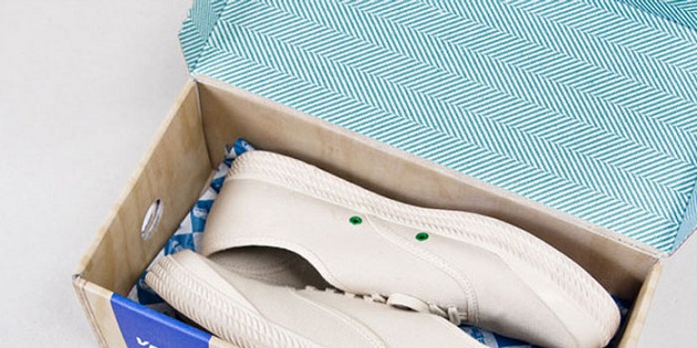
Symmetrical lines and shapes are very popular right now. This Dunlop Volley shoe box does a good job of displaying current trends relevant design. If I was shoe shopping and saw this box (without the shoe being displayed) I would definitely open it up and try the shoes on. Plus, I could stare at the pattern for hours.
Beautiful art work, gorgeous colors, attractive fonts and a short explanation of the product. BRILLIANT. You Smell Soap is one of those products that I would take my time opening as to not ruin the packaging. My favorite part about the paragraph under the picture is the quick mention of the soap’s most important ingredients. A creative combination of all of these things and you have yourself a product people want to buy.
My husband and I love to try new brews any time we travel. The first time I tried Killer Whale Cream Ale was at a friends house. I saw it in the refrigerator and gasped; the label was so pretty! I loved the colors of it because it visually conveyed the fact that the beverage on the inside was a cream ale. Needless to say, it is a delicious alcoholic beverage (enjoyed responsibly) and the art work that the Bold City Brewing Co. puts out is high quality. It’s like what I said about the coffee cups: if they are creative enough to put out attractive packaging, then their beverage is probably handled with the same care.
Cambium is a shop/community where you can pay a monthly fee to receive different wood working tools. This is the package you get when you sign up, and I thought it to be so handsome and distinguished. Their target demographic is 50-60 year old men, and I think they did an exquisite job packaging it accordingly. Woodworking involves patience and focus, and the design and colors displayed here encourage that mentality and life style.
Bright colors! Who doesn’t love those, especially when fruits and veggies are involved. the Tasty Pot Co. offers containers full of healthy goodies that are ready to be made into a meal. I love that the colors of the packaging coordinate with the colors of the food inside the container. If the colors don’t catch the eye, the large font surely will.
Ikea gets me. Every time. If the aren’t suckering me in with their stylish and affordable furniture, their snagging me with their fun gadgets. The packaging for this digital camera acts as the camera itself. A two-in-one! Way to conserve material costs and give modern technology a Do-It-Yourself look.
So what kind of packaging and labeling catch your eye? What are some of your favorite packaged products? What styles or designs do you fancy most?


