I’m a big fan of the movies. In fact, it is one of my favorite things to do alone. Weird, right? I love sitting in the movie theater by myself and disconnecting from the world for a couple of hours. I’ll even let you in a little bucket-list goal of mine: I want to have a movie theater all to myself for an entire movie, just once.
Movie Posters are really important when it comes to the promotion of an upcoming film. It gives the audience a taste of what is coming. When done creatively, the audience simply must appease their curiosity and watch the movie. A movie poster many times will make it or break it for me. I want it to jump out at my eyes and lure me in. Here are some movie posters that I’ve seen so far this year that have done just that.
This definitely has a darker feel than the previous Spider Man movies, which makes me really excited. I feel that the designer(s) of this particular poster did a really good job of give the poster itself a 3D look. It’s as though ol’ Spidey is popping right out of the image, and you don’t even need your 3D Wayfarers to feel the illusion.
Tim & Eric. You may love ’em. You may hate ’em. You may have no idea who they are. One thing is for sure, though: they produce some of the most ridiculous and wacky imagery I’ve ever seen, and this poster for their movie is no exception. It looks ridiculous, but that’s probably the point… and I love it.
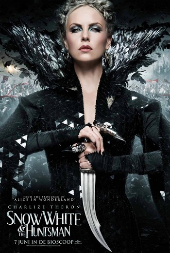
I like this poster because it combines a simple idea and a complex design to really draw you in. The simple idea: Charlize Theron. I mean, come on. When you have an actress of that caliber in a film, just put a big picture of her face and the name of the movie, and people will come see it. After your eyes are drawn to the image by the fact that she’s in it, you see the complexity and intricacies of the design. They made her look SO EVIL for this movie. I can’t wait to see it.
This one caught my eye because it looks like it could be a movie from the 70’s. I’m a sucker for the vintage look.
This poster left me with so much curiosity that I HAD to look it up. I love the mystery and simplicity of it.
Any poster with Johnny Depp on it is going to immediately draw my attention. So that right there was a great choice. I also love the contrast of colors.
I remember when I saw this for the first time. I got the chills. I mean look at it! So many super heroes and stories in one epic movie! This one also has a 3d look, with each character kind of standing out and holding their own.
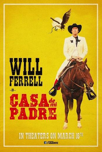
This poster is hilarious to me! Usually old western film posters are very to the point and serious, like this one. However, that’s Will Ferrell on a hoarse. So I can’t take it seriously.
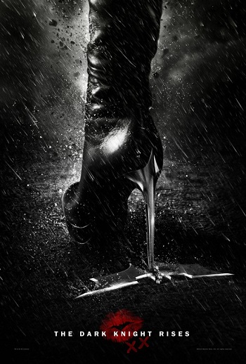
This poster scares me. In fact every piece of advertising for this movie, whether it be poster or trailer, is so intense that I can barely handle it. Cat Woman was pretty twisted in the Tim Burton interpretation of Batman, but I have a feeling Chris Nolan will take the cake on this one.
This is beautiful, and makes me think of Lord of the Rings. It leaves so much to the imagination, and I look forward to seeing it.
So what are some of your favorite movie posters that you’ve seen this year?


