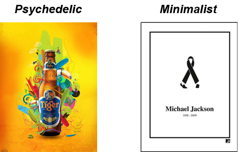
I wrote a blog post on here the other day on Minimalism that has kept me thinking. You see, minimalism, while an excellent choice of design style (especially for logos), quite frankly, is not always going to work.
The flip side to minimalism is typically what advertisers go for…The bigger, the bolder, the better, and as much as I love minimalism, there is some serious truth in that. So how do you know which one to use? Is one truly better than the other? The answers in short are it depends and no.
If Minimalism is simplicity done right, then Bigger-Bolder-Better done right would have to be psychedelic design. The bottom line here is they have to be done correctly. When done right, both can and will be an effective design strategy.
For more info on the debate between Minimalist VS Psychedelic click on the images below.


